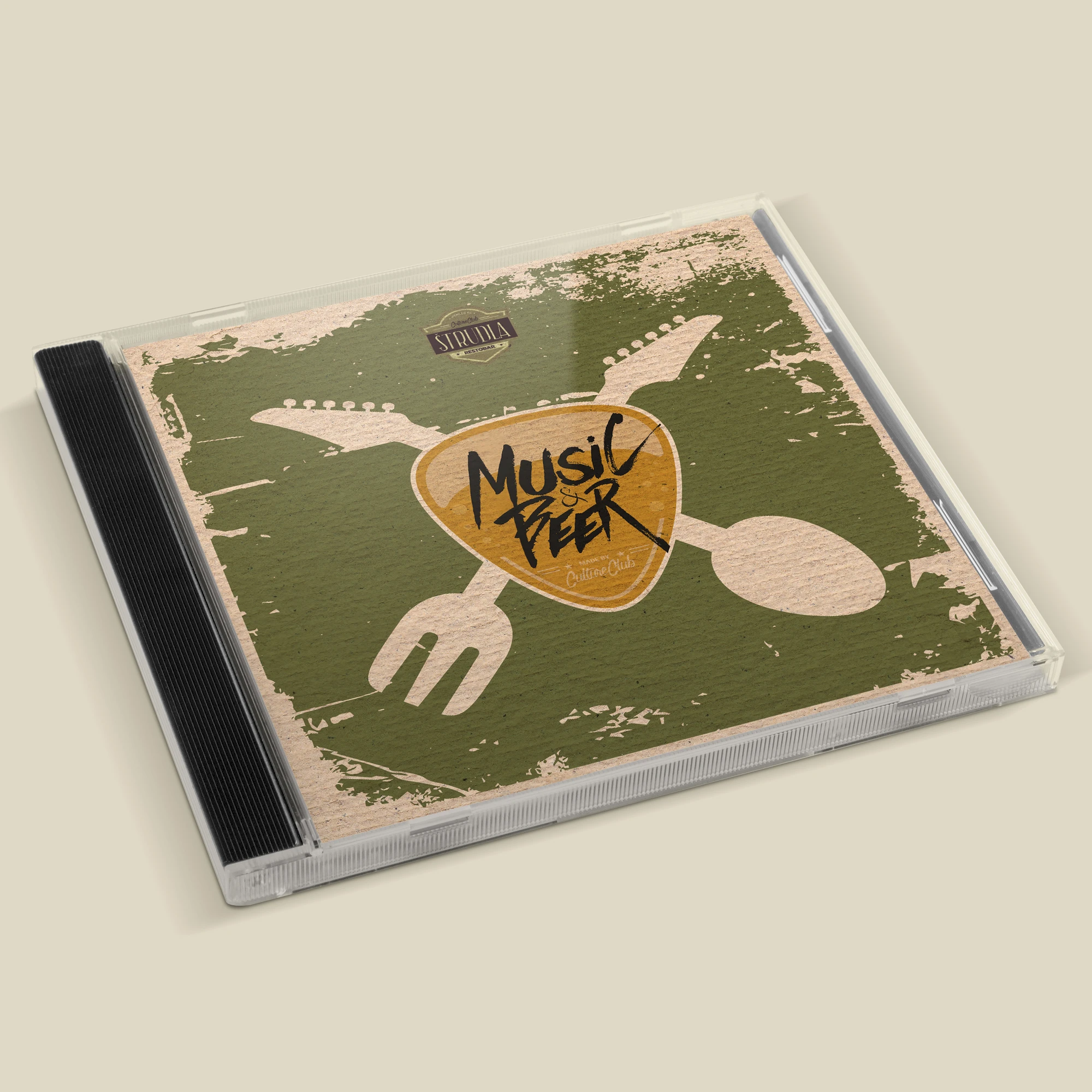
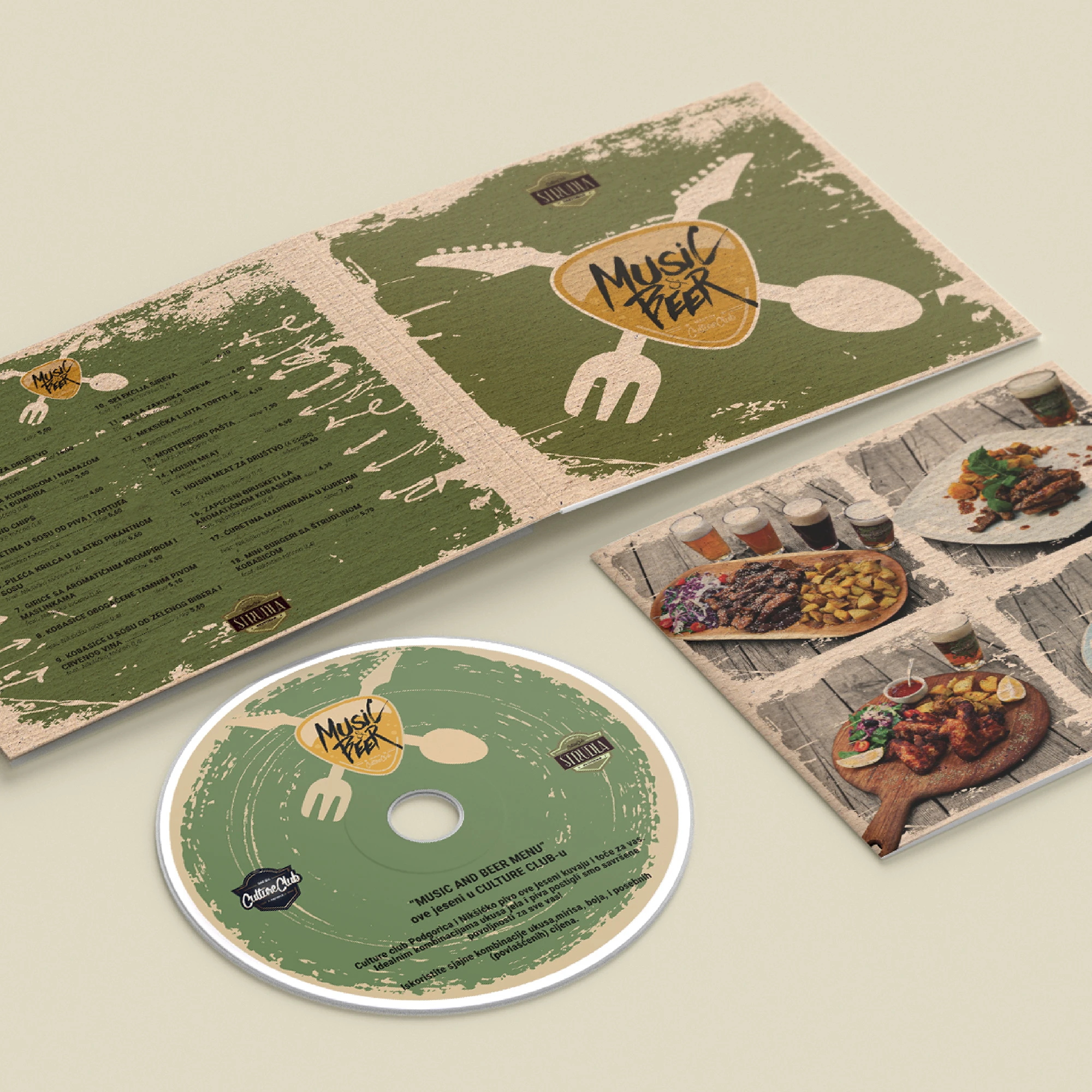
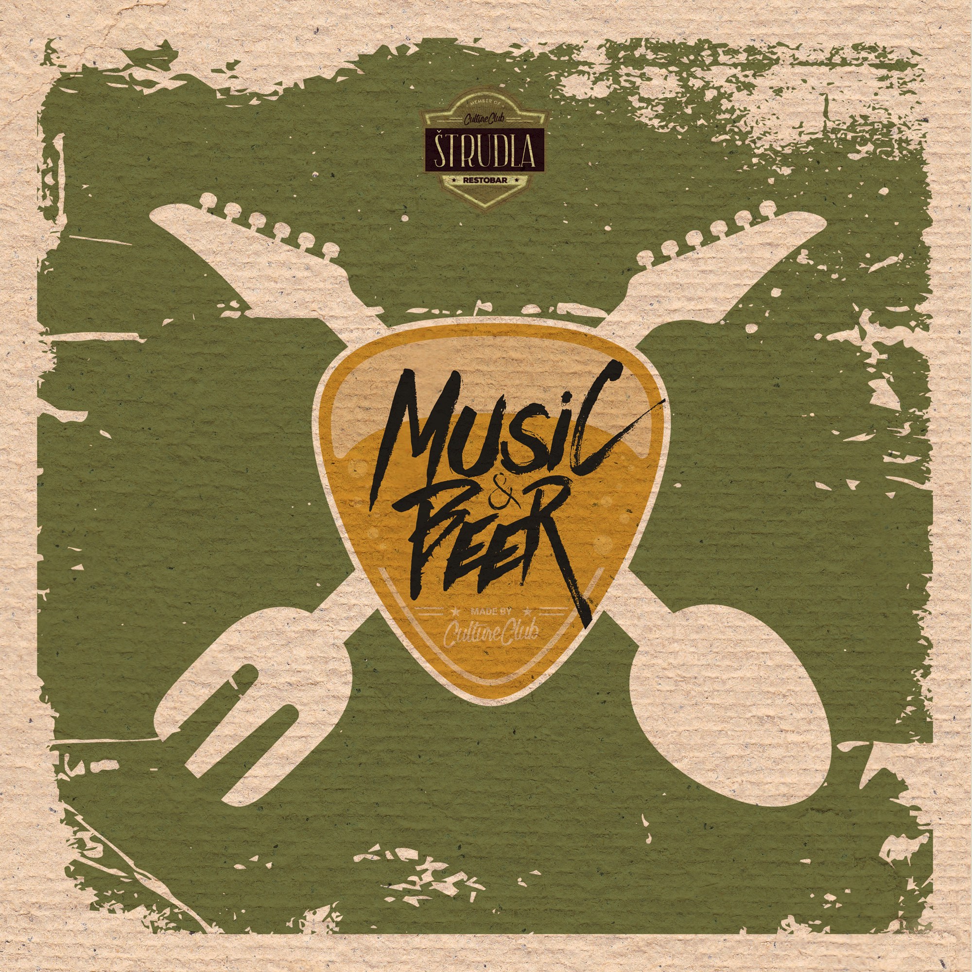
Štrudla uses a domestic food reference and a playful object scene to create a warm, slightly ironic visual tone. Casual lettering and appetitive cues keep the concept approachable, memorable and flexible across cover or packaging-style applications.
This type of work depends on charm and memorability more than explanation, and Štrudla uses exactly that balance. The composition stays approachable and tactile, while the typographic treatment keeps the concept readable enough to extend into packaging-style, cover or promotional applications.
Gallery
All project images are served through ProcessWire image variations with WebP URLs when available.
More work
Related archive items from the same portfolio collection.