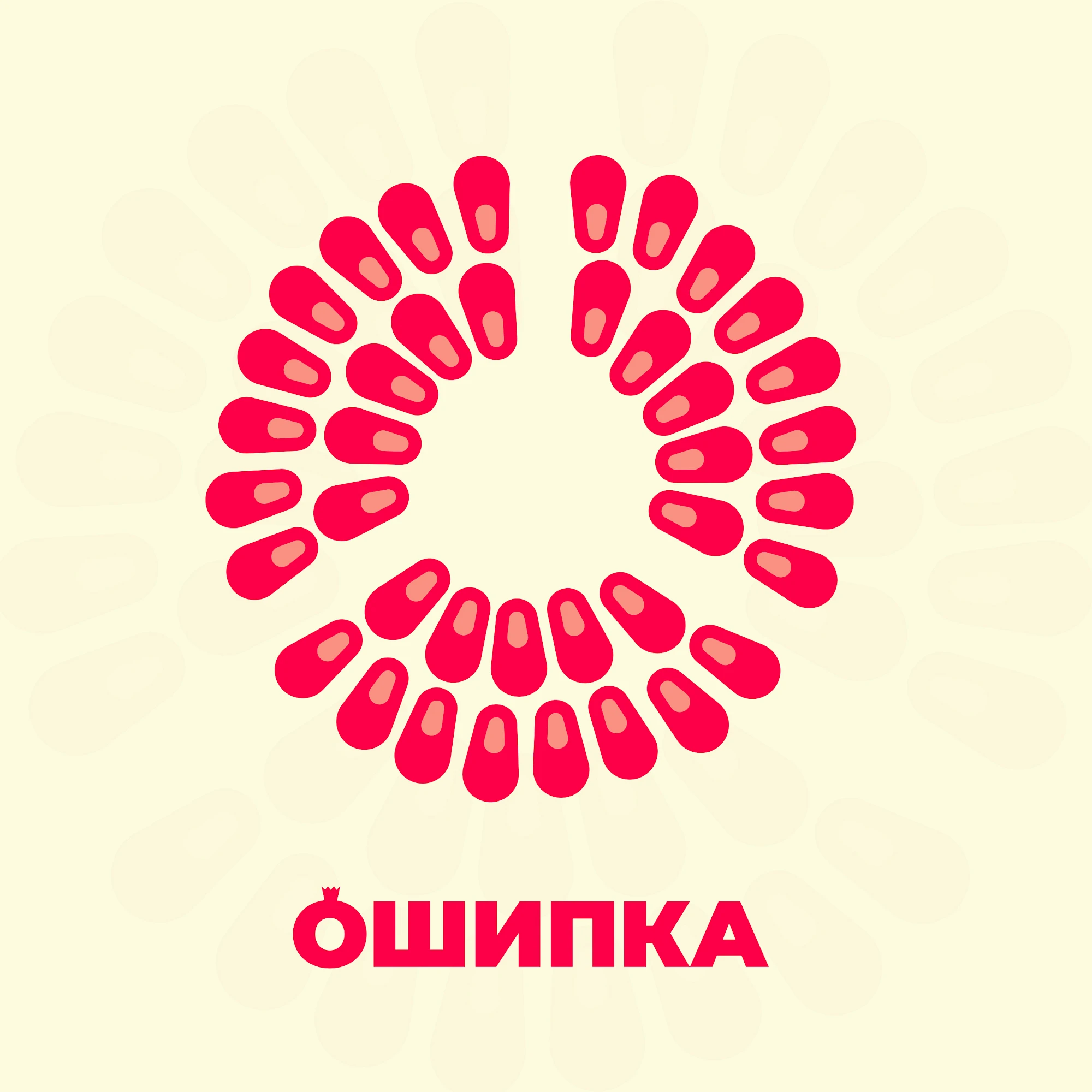
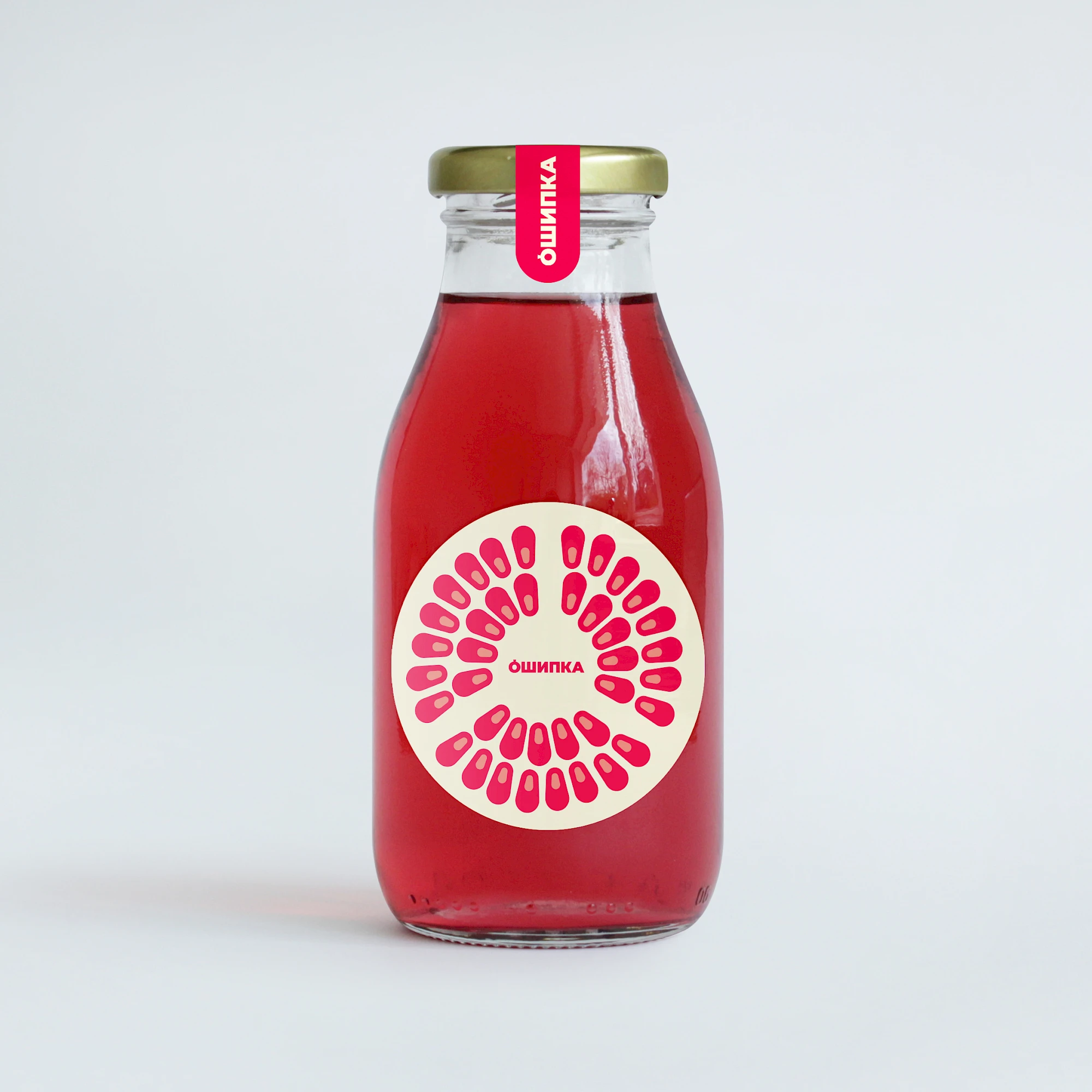
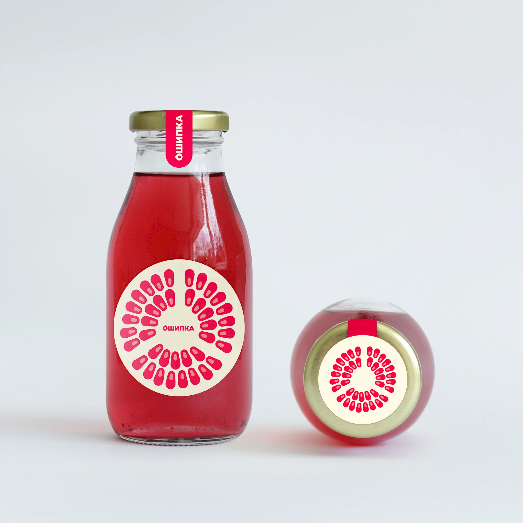
The Ošipka identity is based on repetition and rhythm. Small seed-like forms become a compact circular sign that feels organic, memorable and flexible enough for packaging, print and digital contexts.
From a design standpoint, Ošipka works best when the mark stays disciplined: clear silhouette, stable proportion and enough restraint to survive different scales and surfaces. The real value is not ornament, but recognisability under pressure, whether the identity sits in a header, on printed material, in signage or inside a tighter digital layout.
Gallery
All project images are served through ProcessWire image variations with WebP URLs when available.

More work
Related archive items from the same portfolio collection.