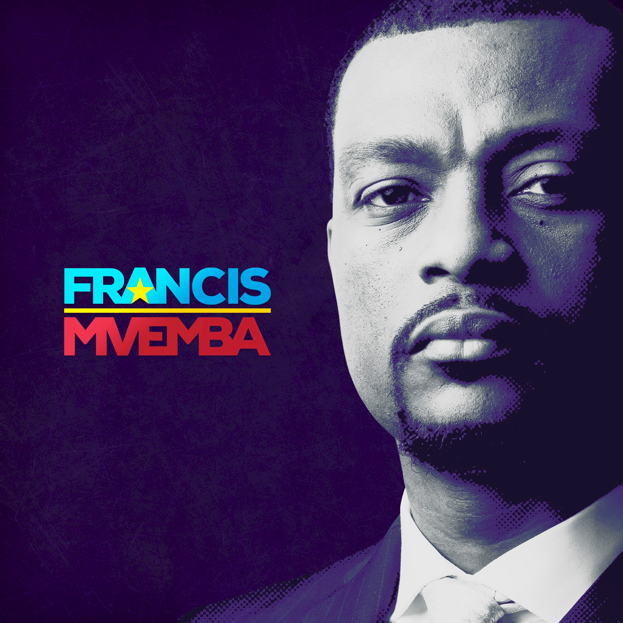
Kongo is handled as an editorial portrait piece with a firm, high-contrast graphic voice. The reduced palette and compact composition keep the image and title in direct conversation, making the poster easier to remember.
The editorial strength of Kongo comes from reduction. Instead of overloading the frame, the design lets cropping, tonal contrast and visual pacing do the work, which gives the final piece more authority and makes the message feel sharper across print and digital promotion.
Gallery
All project images are served through ProcessWire image variations with WebP URLs when available.



More work
Related archive items from the same portfolio collection.