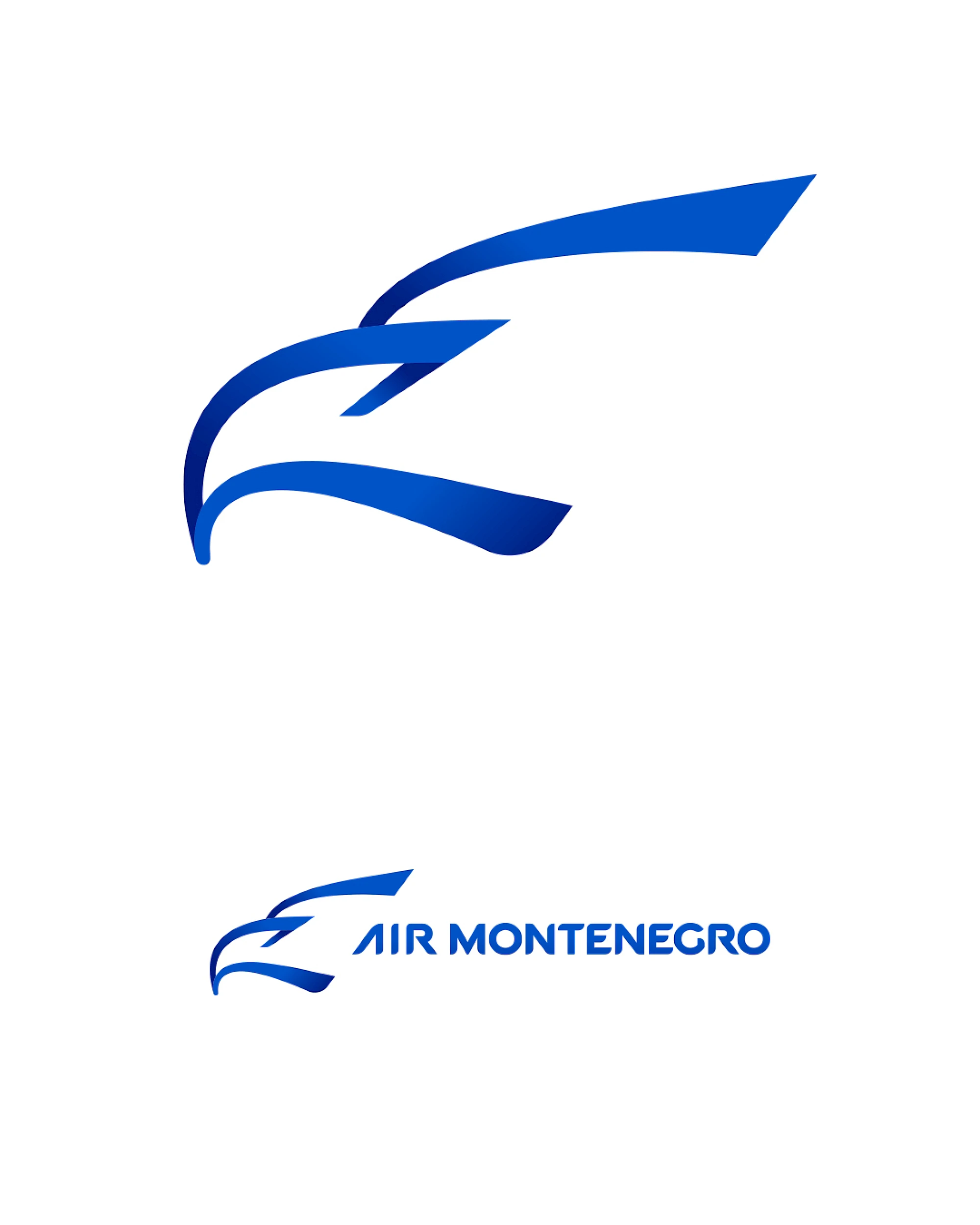
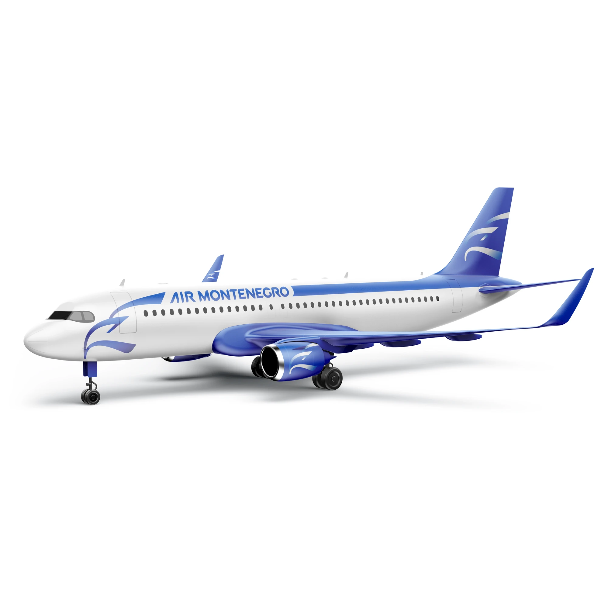
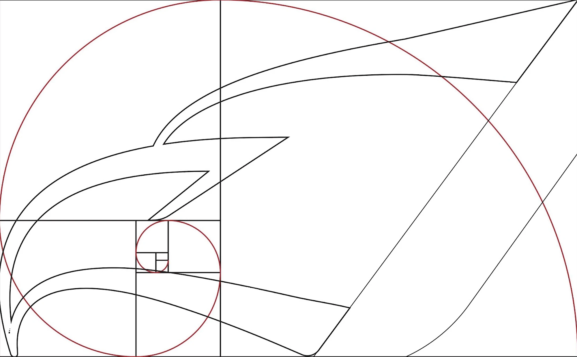
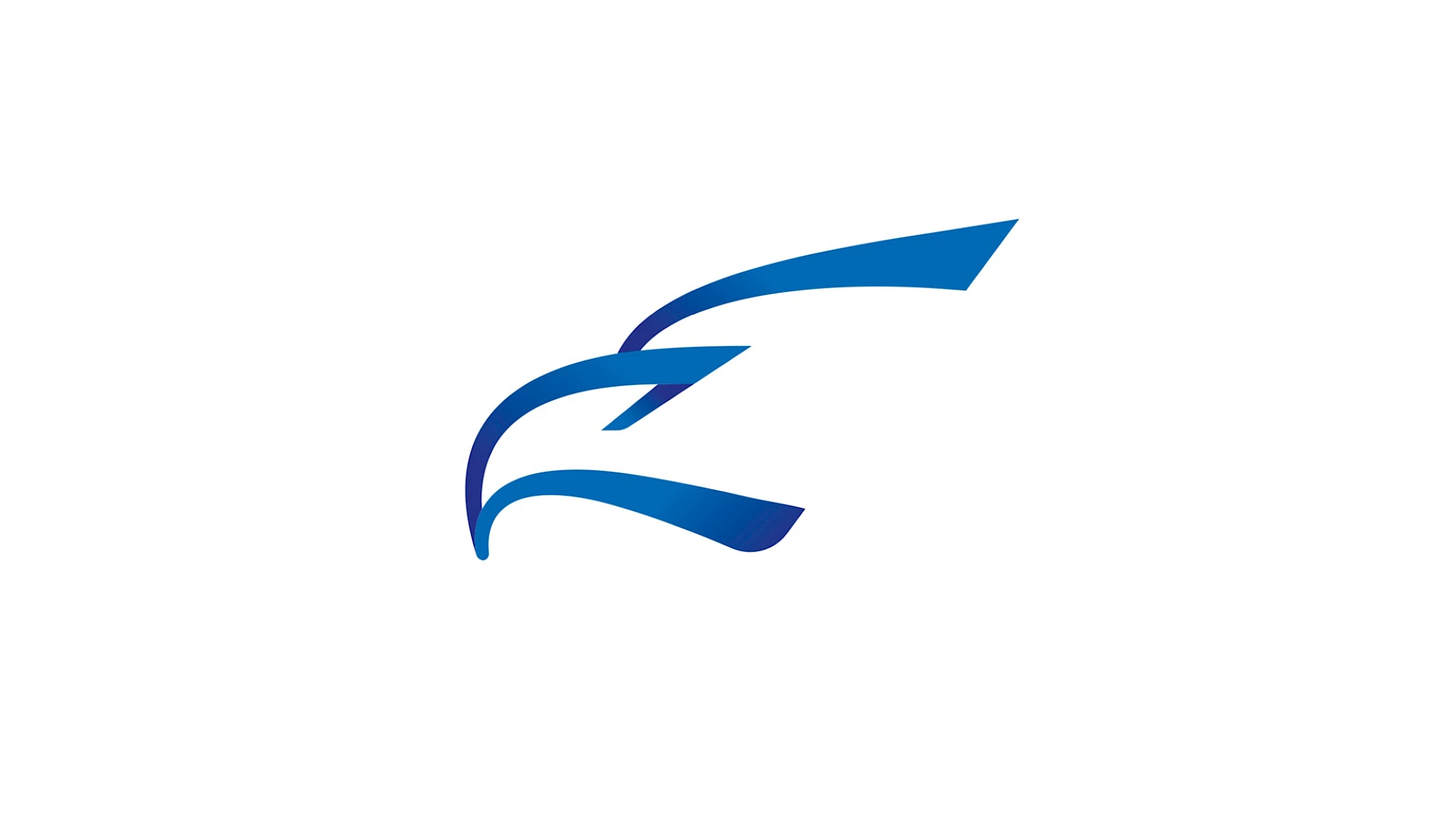
Visual identity created for Air Montenegro, the national flag carrier launched in 2021. In an airline context, the mark has to work with more discipline than a typical logo: on aircraft tails, boarding documents, airport wayfinding and small digital surfaces. The symbol succeeds because it can be read as a wing, a route and an abstract bird in one motion, giving the brand national character without sacrificing speed, clarity or technical precision.
From a design standpoint, Air Montenegro works best when the mark stays disciplined: clear silhouette, stable proportion and enough restraint to survive different scales and surfaces. The real value is not ornament, but recognisability under pressure, whether the identity sits in a header, on printed material, in signage or inside a tighter digital layout.
That balance is especially important in aviation, where trust and repetition matter as much as visual distinctiveness. A good airline identity has to feel durable over time, and this direction is strongest precisely because it is simple enough to travel.
Gallery
All project images are served through ProcessWire image variations with WebP URLs when available.



More work
Related archive items from the same portfolio collection.