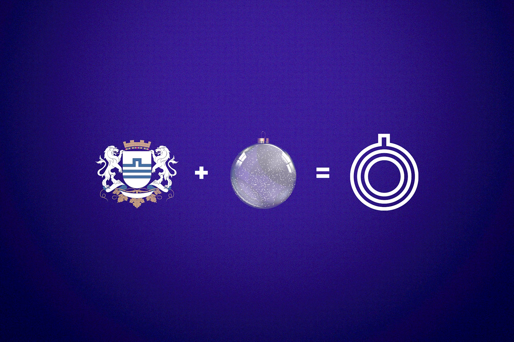
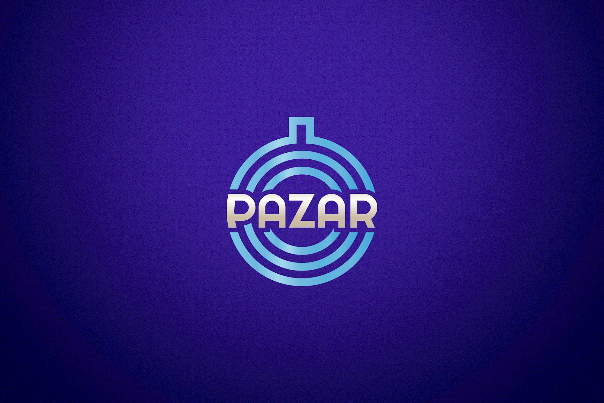
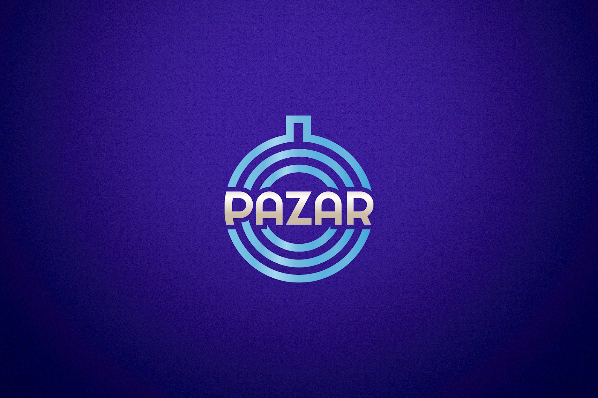
Pazar je organizovan oko kružnog znaka od koncentričnih lukova. Forma se čita kao pijaca, ulaz ili mjesto okupljanja, dok je prilagođeni tipografski znak čvrsto ugrađen u simbol.
Ponavljanje i simetrija stvaraju prepoznatljivost prije detalja. Jasna konstrukcija omogućava identitetu da se širi kroz signalizaciju, ambalažu, prostornu grafiku i digitalnu komunikaciju.
Galerija
Sve slike projekta isporučuju se kroz ProcessWire varijacije, u WebP formatu kada je dostupan.

Još radova
Još odabranih projekata iz iste portfolio cjeline.