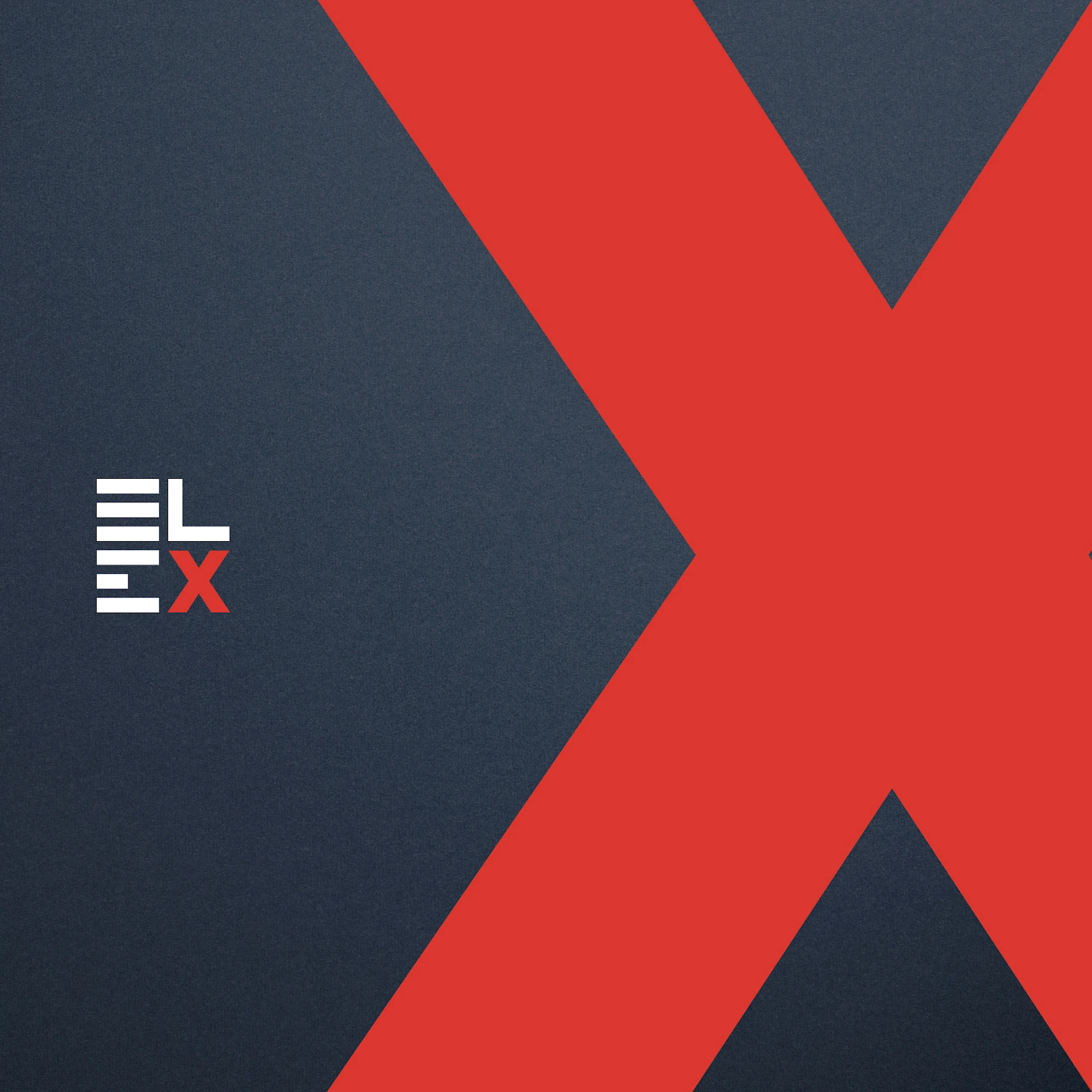
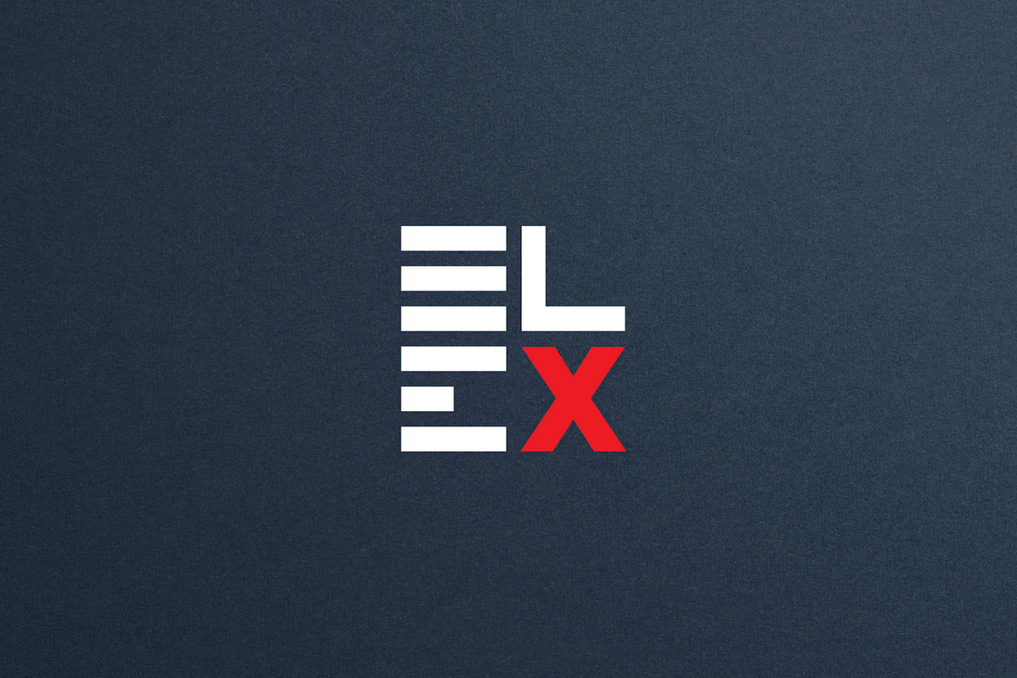
ELEX koristi modularnu konstrukciju slova da kratko ime pretvori u kompaktan vizuelni blok. Horizontalni potezi grade ritam, a crveno X prekida sistem jasnim kontrastom.
Snaga znaka počiva na proporciji, ne na ukrasu. Ostaje čitljiv u maloj veličini, dovoljno snažan za signalizaciju i štampu, a može se širiti kroz mreže, ponavljanje i crveni akcenat.
Galerija
Sve slike projekta isporučuju se kroz ProcessWire varijacije, u WebP formatu kada je dostupan.
Još radova
Još odabranih projekata iz iste portfolio cjeline.